AI Enterprise Education
Brand identity
A single, implementation-ready system for how AIEE looks, sounds, and shows up across product, marketing, social, print, and partner touchpoints—white-first, education-led, enterprise-credible.
This guide is written for designers, marketers, educators, and vendors. It connects brand rules to the live product (tokens, layouts, components) so executions stay consistent from Figma to production.
Social examples below are high-fidelity illustrative layouts that show how approved logo, color, and copy sit inside common profile and channel patterns—not screenshots of third-party products, and not implied endorsement.
- Logo lockups, clear space, and minimum sizes
- Color tokens, typography, and accessibility expectations
- Voice & tone for enterprise education contexts
- Photography and imagery direction (subjects, lighting, composition)
- Social safe zones with platform-by-platform visual references
- Web UI patterns, wireframe, architecture, stationery, and print
Illustrative UI chrome only; align final exports to each platform’s latest asset specs and brand policies.
Brand essence
AIEE is precise, calm, and education-first: generous white space, crisp typography, and interfaces that feel lightweight rather than loud.
Default surfaces are white or near-white; accent color is used sparingly for actions and focus. This balances corporate trust with a Gen‑Z minimalist aesthetic—clean grids, subtle borders, no visual noise.
In external communications, lead with outcomes for learners and organizations—clarity over hype, evidence over slogans, and inclusive language that respects classrooms and workplaces worldwide.
Voice & tone
Write for busy professionals and curious learners: short sentences, concrete verbs, and explicit next steps. Prefer active voice; avoid jargon unless you define it once.
Enterprise credibility comes from specificity—name the skill, the cohort, and the measurable outcome. Gen‑Z accessibility comes from plain language, respectful humor only when on-brand, and zero condescension.
Calls to action should be singular per surface (one primary outcome). Error and system messages stay calm, blame-free, and solution-oriented.
Photography & imagery
Show real learning contexts: diverse classrooms, hybrid teams, and hands-on practice with clear light and shallow depth-of-field where appropriate. Avoid stock clichés (overly perfect smiles, fake whiteboards).
Color grade neutrally so UI blues and whites stay true; do not tint photography to match the accent color unless art-directed for a campaign.
When placing the logo on photography, use a white or neutral panel or soft gradient scrim behind the mark to preserve contrast.
Logo & wordmark
Primary mark is the AIEE wordmark (bold, tight tracking). When a site logo image is configured in admin settings, it may appear alongside or instead of the wordmark in product chrome—never mix competing marks in one lockup.
Sample
- Clear space: keep padding at least equal to the cap height of “E” on all sides of the wordmark or logo bounding box.
- Minimum digital size: about 120px width for full wordmark on web; smaller sizes use simplified treatments or icon-only assets if provided.
Do not
- Stretch, rotate, skew, or add outlines/glows to the mark
- Place on busy photography without a white or solid neutral panel
- Change letterspacing or recreate the logotype in a different typeface
- Use low-contrast color combinations that fail WCAG for adjacent text
Download logo files
Download the approved AIEE wordmark as SVG or PNG. It matches the live navbar logotype. Older circular-icon or alternate lockup artwork is not the primary brand mark unless your team has explicitly approved it.

Color & typography
The approved brand palette for communications is **two tokens only**: an off-white canvas (`--brand-bg`) and a dark navy text color (`--brand-text`). Do not introduce extra accent colors for brochures, slides, or marketing unless a separate campaign is explicitly approved.
Prefer system or geometric sans-serif stacks already used in marketing layouts; keep headings sentence or title case for a modern, approachable tone.
Fonts in the product
Default body, UI, and marketing surfaces use Inter, loaded with Next.js `next/font` and referenced through --font-sans-stack, with `ui-sans-serif` and `system-ui` fallbacks.
The downloadable AIEE wordmark files use Arial Bold in SVG/PNG so they stay consistent with typical system rendering and the navbar.
Headings use the same sans stack as body text—no separate display serif—so dense layouts (including classwork drag-and-drop) stay stable across breakpoints.
Where quizzes and learning content render mathematics, KaTeX loads its own fonts for formulas.
Reference in code (globals.css)
--font-sans-stack: var(--font-sans), ui-sans-serif, system-ui, sans-serif;Inter for design files
Inter is bundled for on-screen body and UI text via `next/font`. Use Inter (SIL Open Font License) in Figma or slides when you need a matching installable font for static comps; exported wordmarks still use Arial.
Inter (variable, Latin)
Bundled for live UI; pair with `--brand-bg` and `--brand-text` in specs. For static comps you can use the same Inter files or the optional desktop download below.
Helvetica Neue is a commercial typeface: obtain appropriate desktop licenses from your font vendor if you typeset print or Office files with it.
Corporate color theme
Use only these two CSS variables for brand surfaces and typography: `--brand-bg` for backgrounds and `--brand-text` for all primary body copy and headings (dark navy / near-black). Do not add a separate “accent” color for charts or highlights in external-facing materials.
--brand-bgApplication and long-form marketing backgrounds (off-white).
--brand-textPrimary body copy and headings.
Other variables may exist in code for UI chrome; for brand-correct brochures, decks, and flyers, stick to `--brand-bg` and `--brand-text`. Theme settings can override hex values—verify contrast (WCAG) after any change.
Preview (brand palette)
Page wireframe (marketing shell)
Most public pages follow a simple vertical rhythm: global navbar → hero → supporting sections → footer wordmark. Content blocks use a single-column stack on small screens and widen into grids at `lg` breakpoints.
+--------------------------------------------------+
| [ Nav | AIEE | Menu ................... Auth ]   |
+--------------------------------------------------+
|  Hero: headline + subcopy + primary CTA          |
+--------------------------------------------------+
|  Section cards / feature grid                    |
+--------------------------------------------------+
|  Social proof, FAQ, or resources (optional)      |
+--------------------------------------------------+
|  Footer: sitemap columns + large AIEE wordmark   |
+--------------------------------------------------+
ASCII wireframe — spacing and section order, not pixel layout.
System architecture (high level)
The live product is a Next.js application with authenticated areas for educators, students, and admins. Public marketing routes share the same design language but avoid authenticated data.
Request path
Client (browser)
React/Next.js pages, client components for interactive UI, Clerk for sign-in state.
Edge & APIs
Route handlers under `/api/*` for quizzes, settings, uploads, billing hooks, and webhooks.
Data & services
MongoDB for app data; file storage integrations; AI provider APIs for generation features.
Stationery & applications
Corporate stationery
- Letterhead: white base, AIEE wordmark top-left, contact block bottom-left, generous margins
- Business card: front wordmark + name/title; back optional QR to the website
- Envelope: return address aligned to brand margin grid; use solid black or primary accent for emphasis sparingly
- Notepad / memo cube: top-bound or glue-top; cover wordmark only, or small mark in the sheet header—no off-brand colors
- Labels & seals: return-address labels or small round seals—black or primary on white; test adhesion on envelope stock
Illustrative print previews—not to scale; supply vendors PDF/X with bleed and your approved Pantone or CMYK builds.
Letterhead
A4 or US Letter; mark and wordmark top-left, generous margins, contact block anchored bottom-left.
Business card
Typical 85×55 mm; front shows mark + name/title; reverse may carry a QR to the website.
Envelope
Return address aligned to the margin grid; position mark for stamp zone or flap per envelope template.
Gen‑Z minimalist (white-back)
- Thank-you / note cards: plenty of whitespace, thin rule or micro-logo only
- Stickers & laptop decals: single-color or duotone mark on white or clear stock
- Slide decks & one-pagers: white background, one accent, large type, minimal bullets
Thank-you / note card
Maximum whitespace; one hairline rule or a tiny corner mark—no dense body copy.
Sticker & decal
Single-color or duotone mark; white vinyl or transparent stock for laptops and gear.
Slide / one-pager
16:9 decks or a print one-pager: white field, one accent, oversized headline, minimal bullets.
Events, staff & wearables
- Lanyard: woven or dye-sublimated strap in black or neutral; clip to a clear badge holder; keep the AIEE mark legible—avoid crowding with unrelated sponsor marks
- Staff / visitor ID (CR80 landscape): photo, name, role, optional QR; wordmark on a solid header bar (white mark on dark bar, or reverse on white)
- Event badge (vertical): large attendee name, small role; place the mark in a top or bottom safe zone away from clip holes
- Retractable badge reel: optional; single-color housing with debossed or one-color printed mark—no rainbow gradients
- Presentation pocket folder: A4, heavy stock; cover wordmark + spine title; inner pocket for one-pagers, SOWs, or contracts
Lanyard & badge holder
Strap + clip + vertical insert: mark and name hierarchy clear at arm’s length; use brand neutrals for strap unless event art directs otherwise.
Staff / visitor ID
CR80 horizontal: header band for brand; photo and text fields aligned to a simple grid; QR only if required by security policy.
Pocket folder
Cover for first impression; spine readable on a shelf; inner pocket keeps collateral crisp—export print PDF with dieline from your vendor.
Website buttons & digital UI
Primary actions use filled primary color; secondary actions use outline or ghost buttons. Links are text-colored with underline on hover where appropriate.
- Maintain tap targets ≥ 44px height on mobile for primary CTAs.
- Pair one primary button per view when possible to reduce decision friction.
- Favicon and app icons should use the simplified mark on white or transparent background.
Print, brochures & large format
Brochures, flyers, posters, and booth graphics should feel as calm and precise as the digital product: generous white space, the AIEE wordmark, token-based color, and usually one clear call to action per piece.
Brochures, flyers & promotional print
Brochures & booklets — Bi-fold, tri-fold, or saddle-stitched: lead with an outcomes-led headline, use approved typography, and place the AIEE wordmark on the cover or inside front; avoid crowding with unrelated graphics.
Flyers & handouts — Single sheets or rack cards for events and campuses: one primary message, scannable bullets, optional QR to a landing page; reserve dense legal copy for an appendix if required.
Posters & pull-up banners — Readable at a distance: large headline or wordmark, minimal body copy, and photography that follows the imagery section of this guide.
One-pagers & sell sheets — Partner or district leave-behinds: white or off-white base, a simple product diagram or stat callout, and the same vertical rhythm as the marketing wireframe (hero → proof → CTA).
Stickers, table tents & swag — Single-color wordmark on white or brand neutrals at small sizes; test legibility at arm’s length before production.
Files, color & finishing
Deliver print vendors PDF/X (or native files with fonts outlined / linked), 3 mm bleed on full-bleed pieces, and keep live text inside the safe margin your template specifies.
Provide CMYK or Pantone builds from your approved primary and neutrals; proof on coated vs uncoated stock.
Place logos and photography at 300 dpi at final size for typical offset/digital sheet printing; large-format vinyl may use lower resolution—confirm with the vendor.
Large-format backdrops and booth walls: extend backgrounds with bleed, check viewing distance so type stays sharp, and align hero content to the safe area on the vendor’s dieline.
Posters, pull-ups & marketing templates
These starter layouts use the AIEE wordmark, off-white field, and dark type—aligned with --brand-bg and --brand-text. Replace placeholder copy with your campaign; keep one primary message per piece. Download the SVGs and edit in Illustrator, Figma, or Affinity.
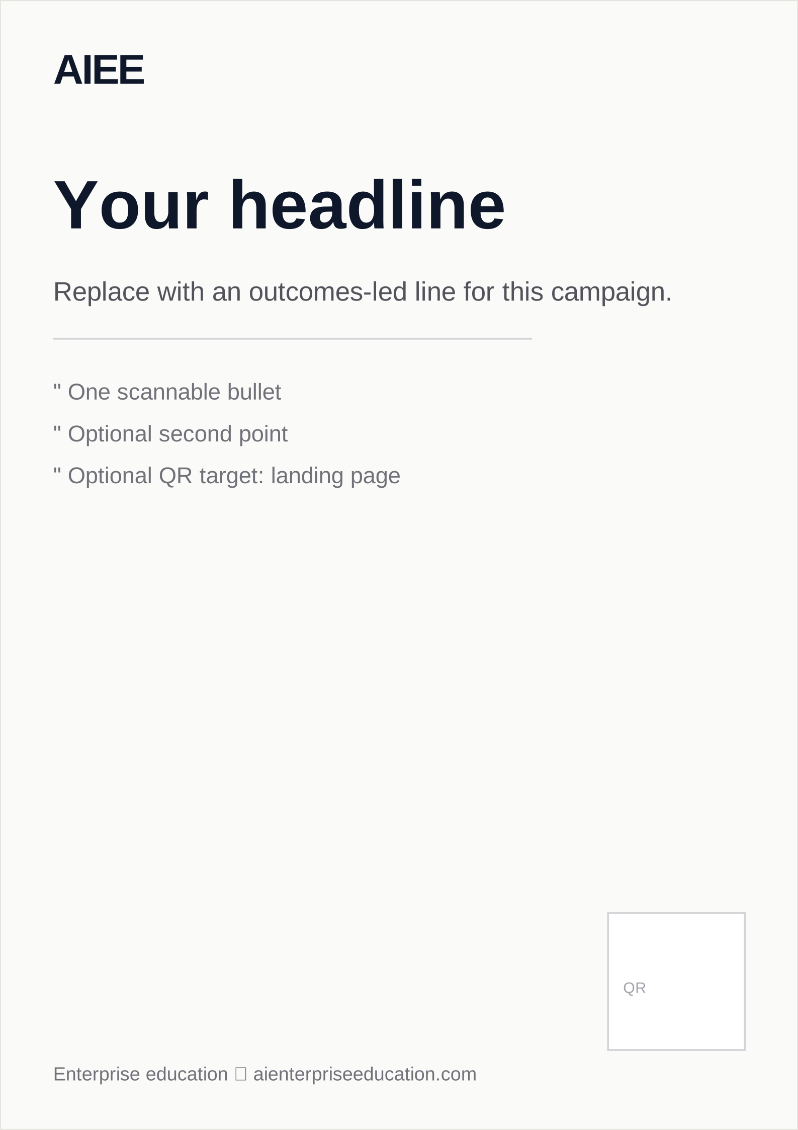
Event & campus posters — Common sizes A2, A1, or regional equivalents: headline, short subcopy, wordmark, optional QR to a landing page. Use 3 mm bleed on full-bleed backgrounds.
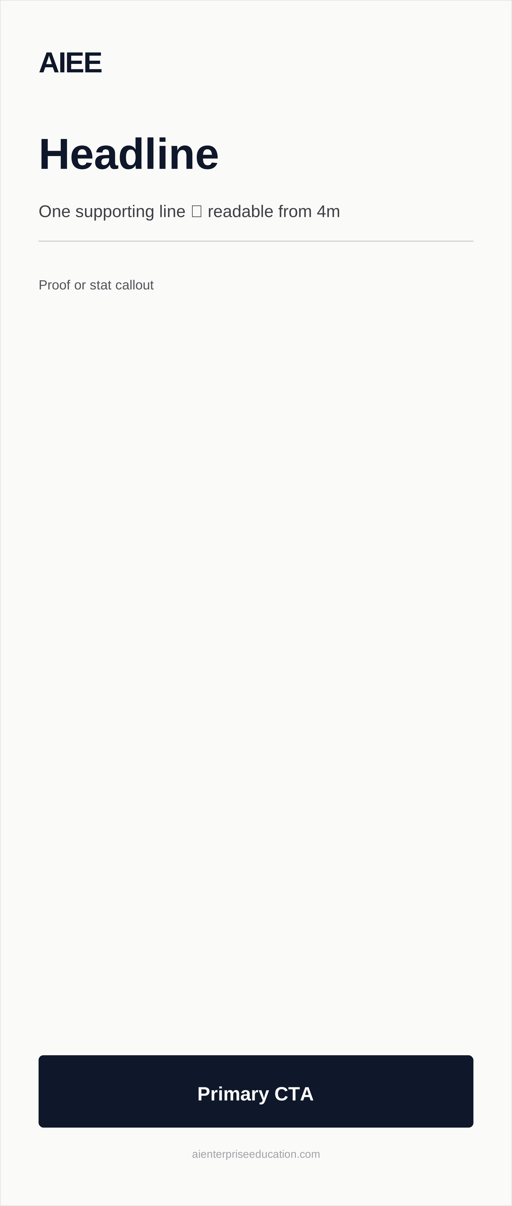
Pull-up / roll-up banners — Typical tall format (~850×2000 mm): logo, headline, one proof line, footer CTA strip; proof at 3–5 m viewing distance.
Event poster (A2 proportion)
Matches the downloadable SVG: wordmark, headline band, bullets, QR zone—export PDF/X for your printer with bleed.
Pull-up banner
Narrow vertical: stack brand, headline, dark CTA bar; safe area depends on stand hardware—confirm with vendor.
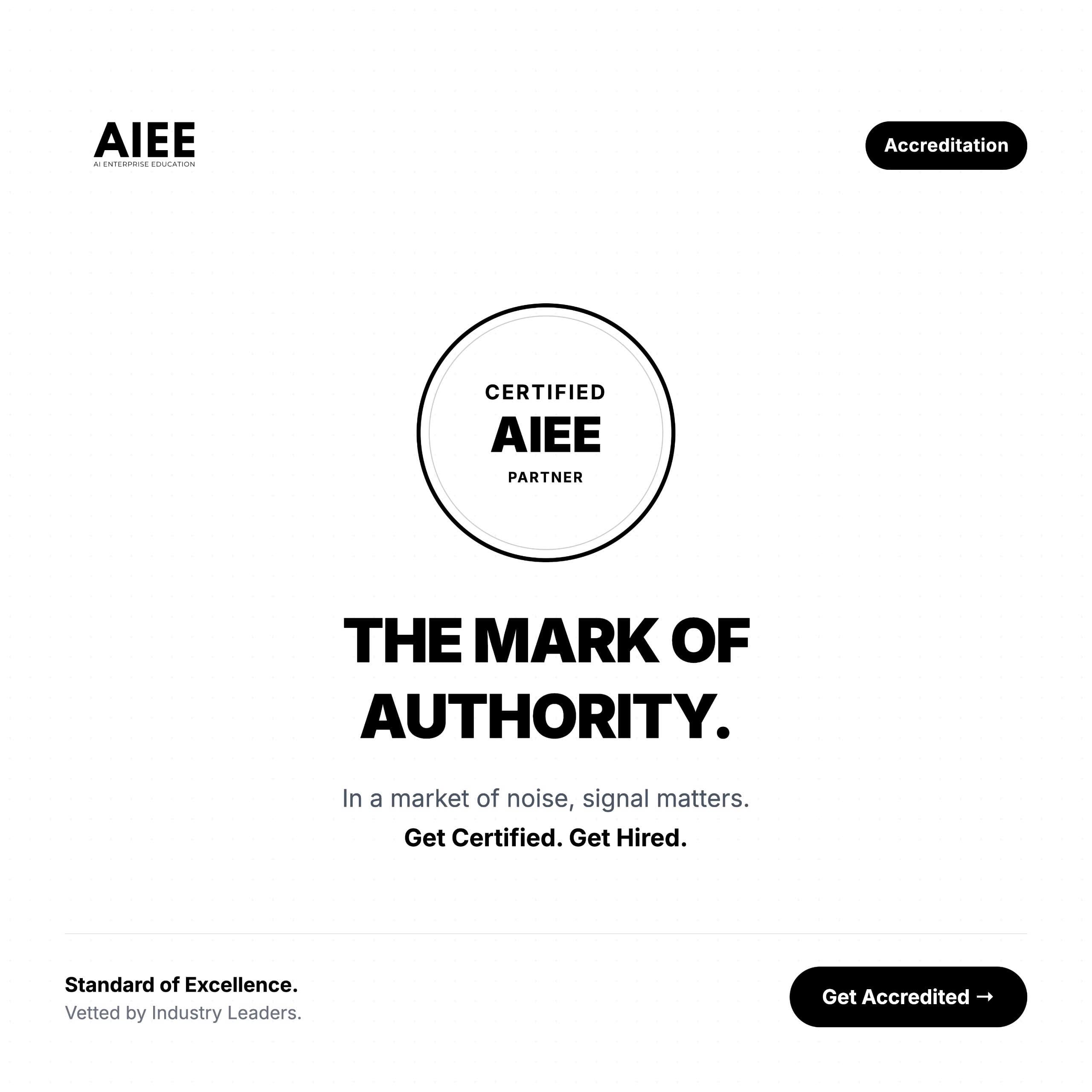
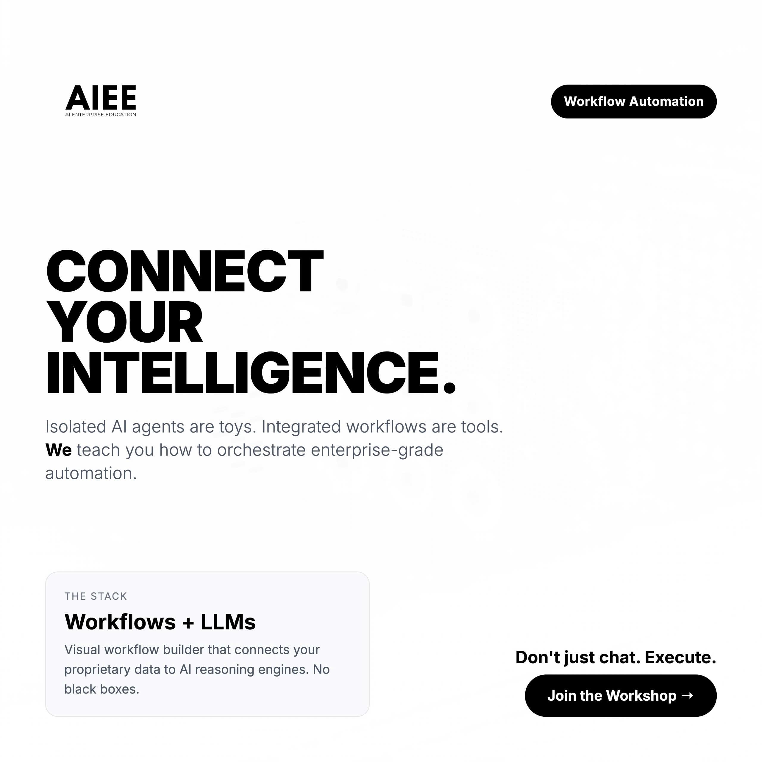
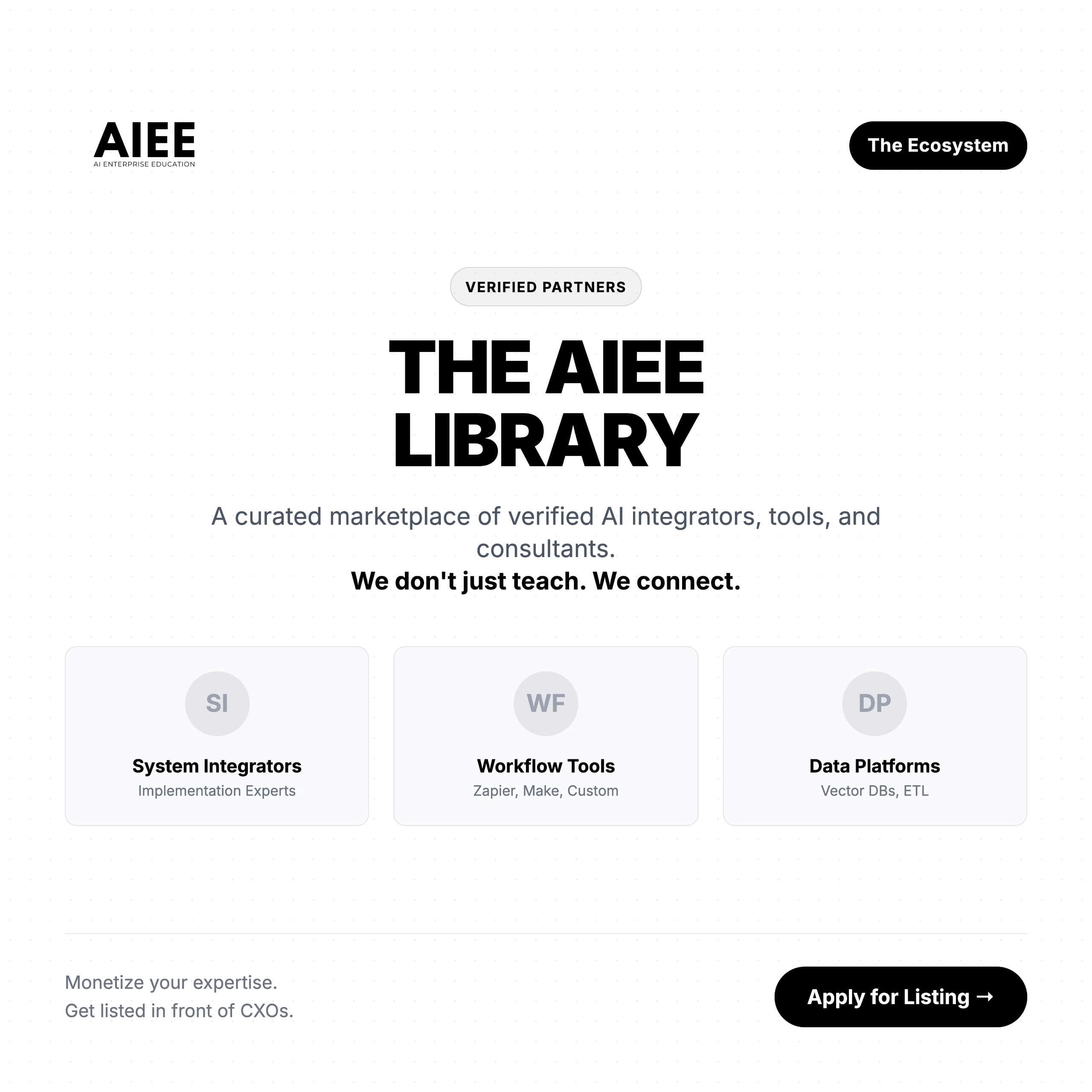
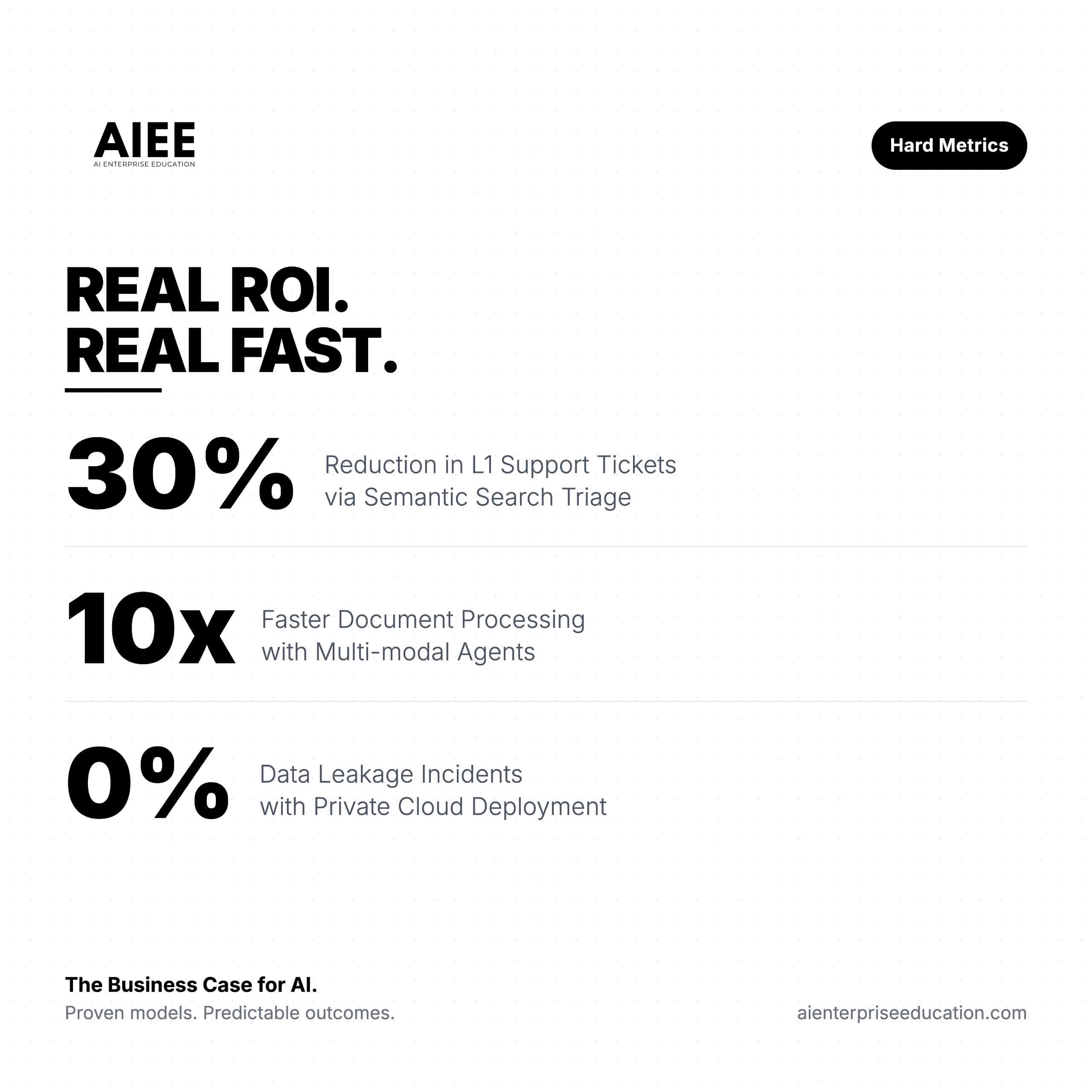
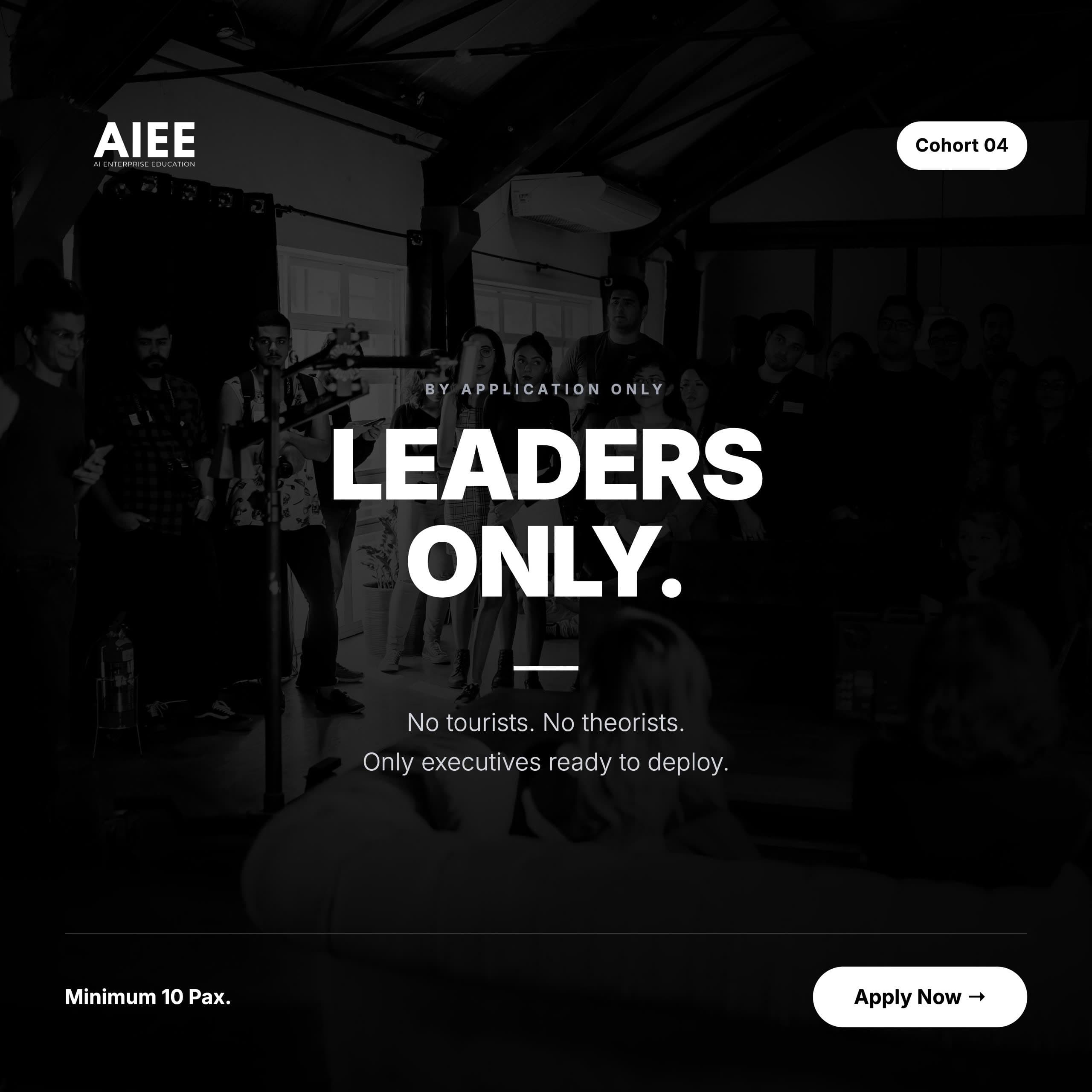
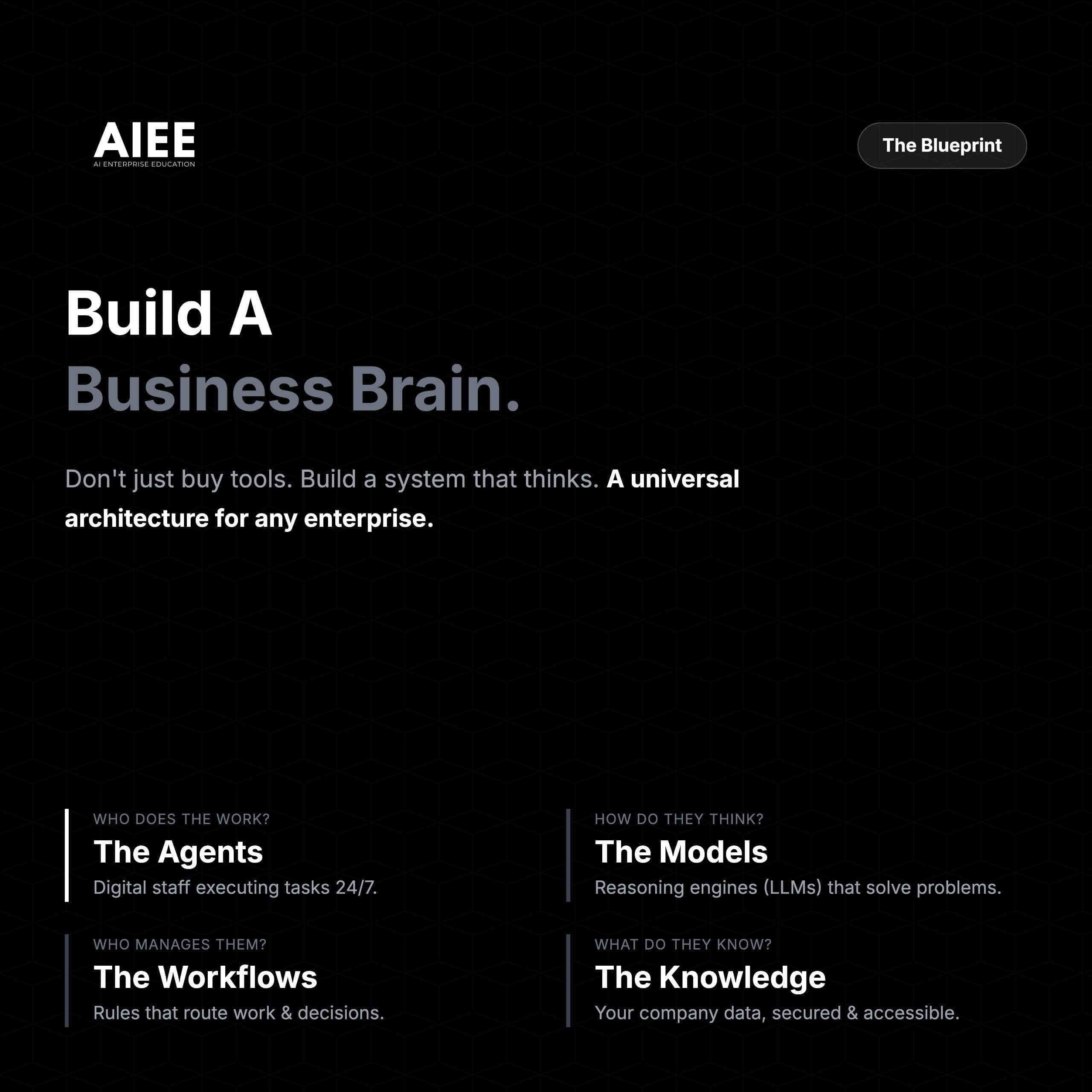
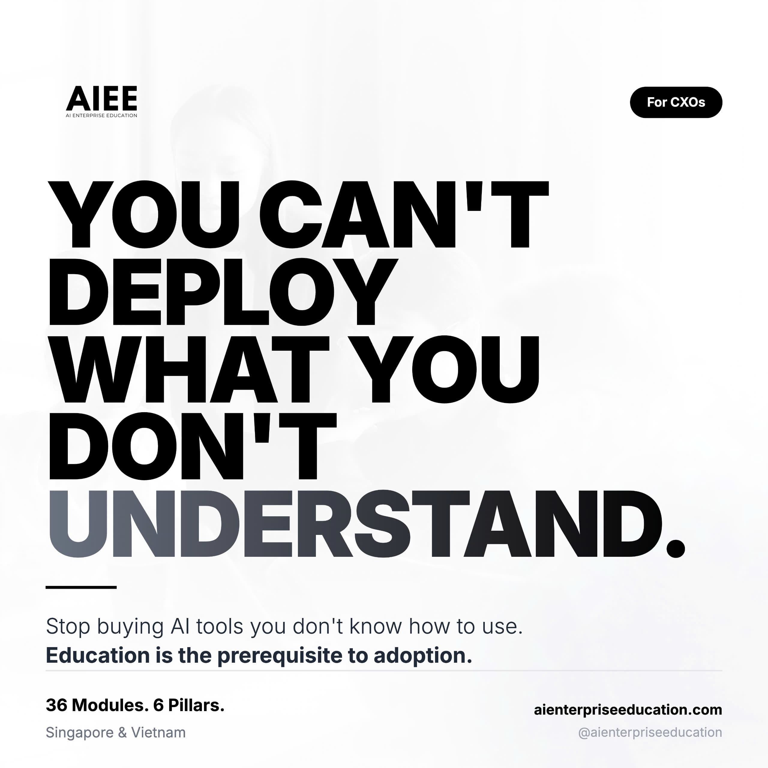
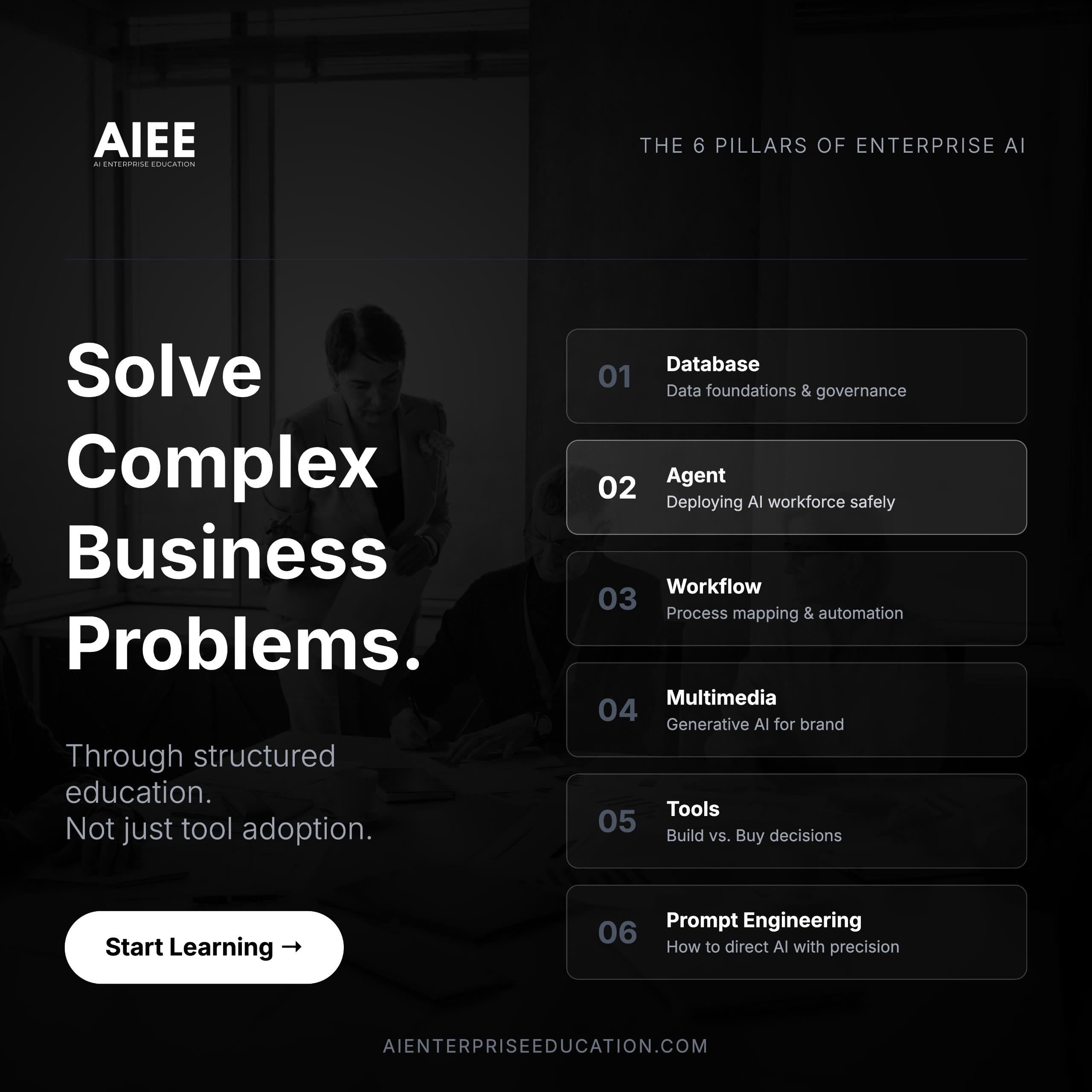
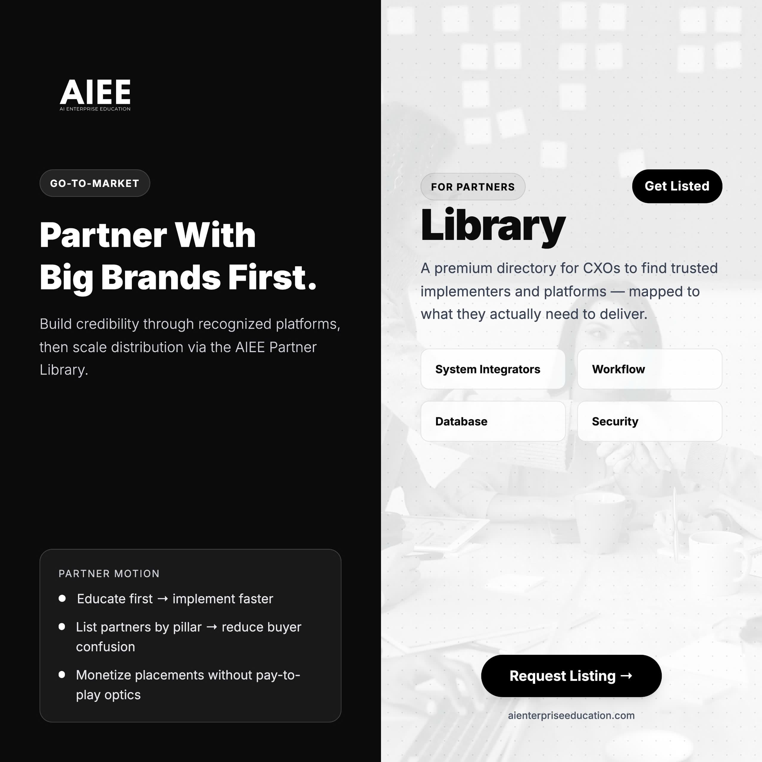
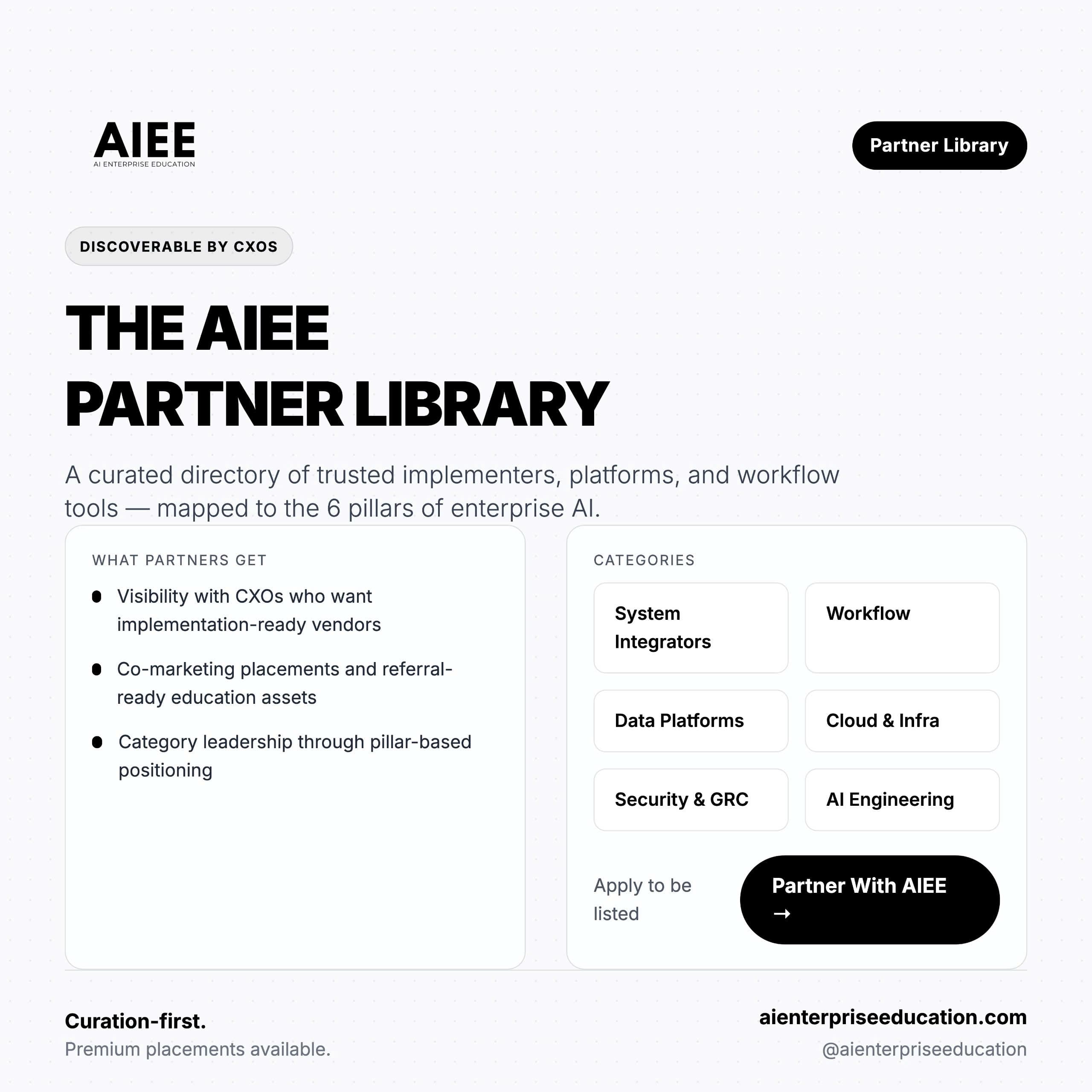
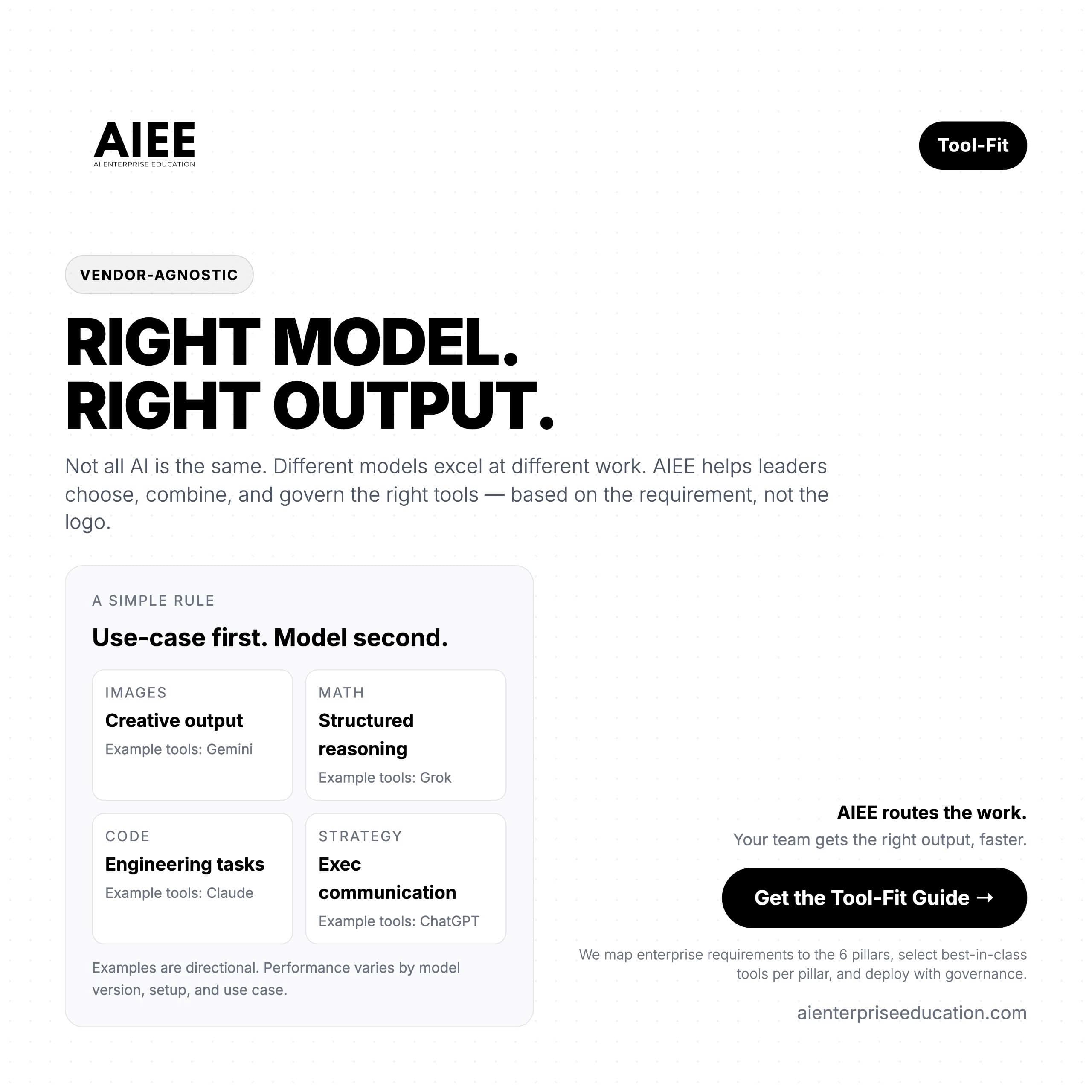
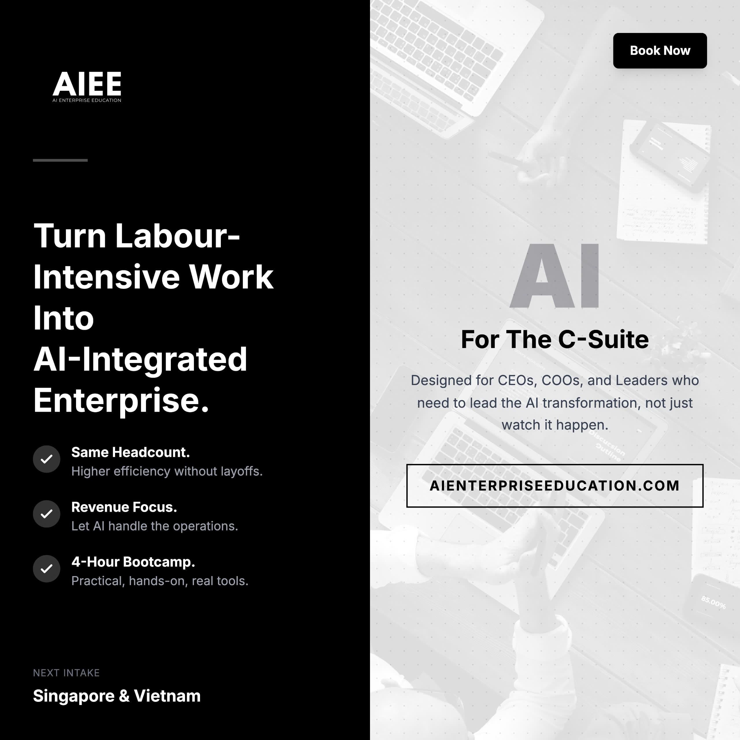
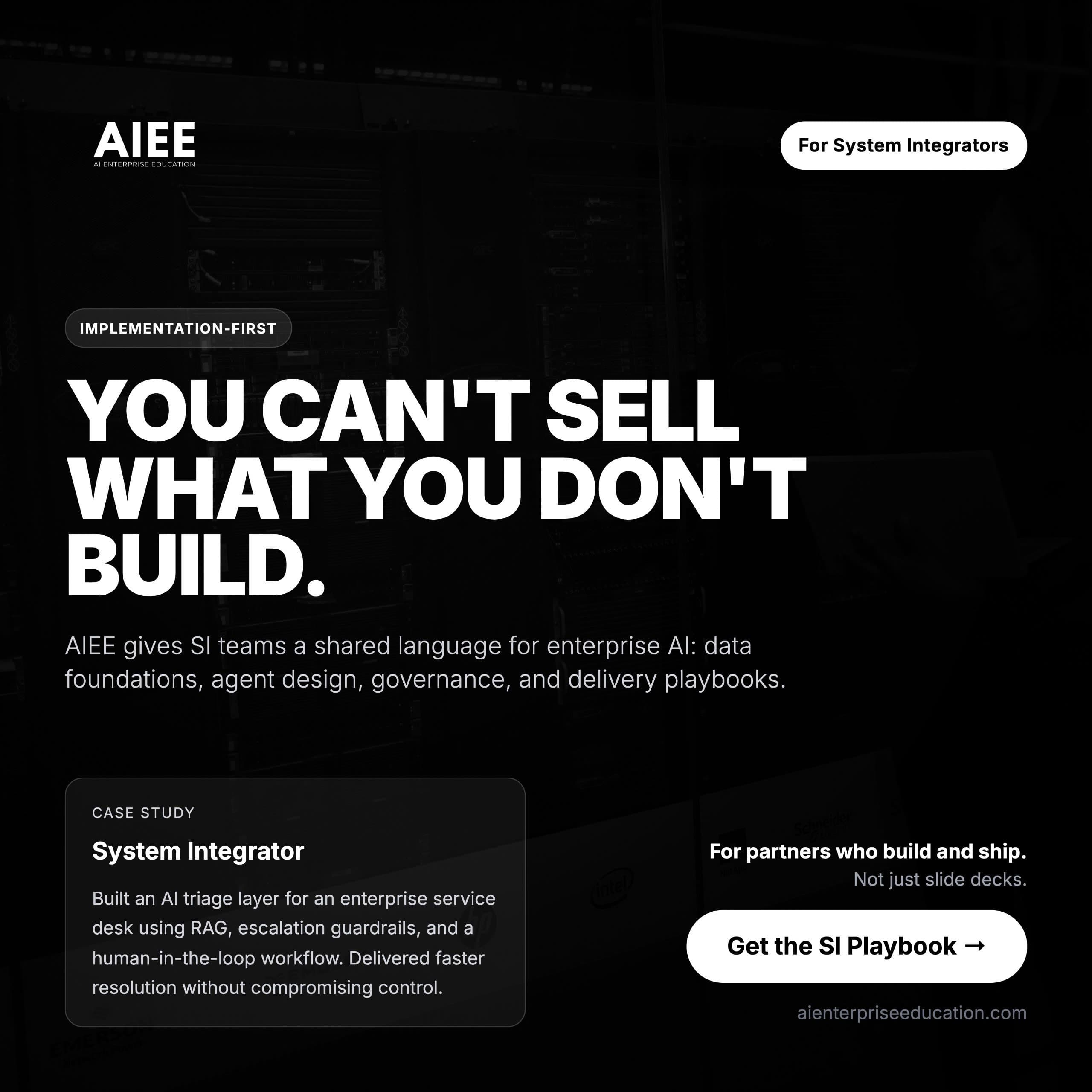
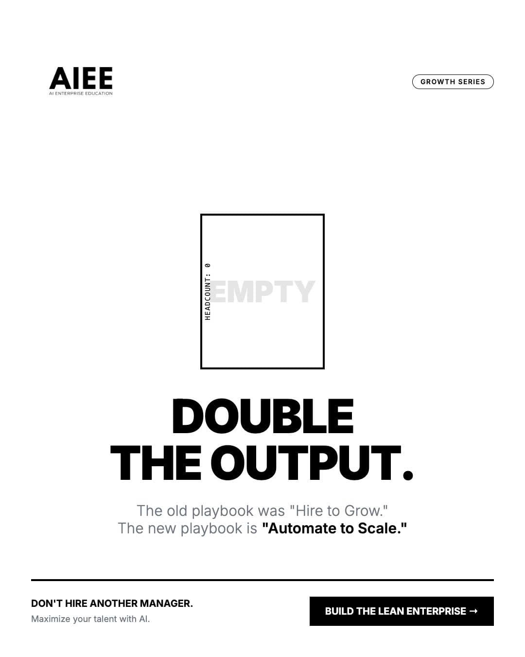
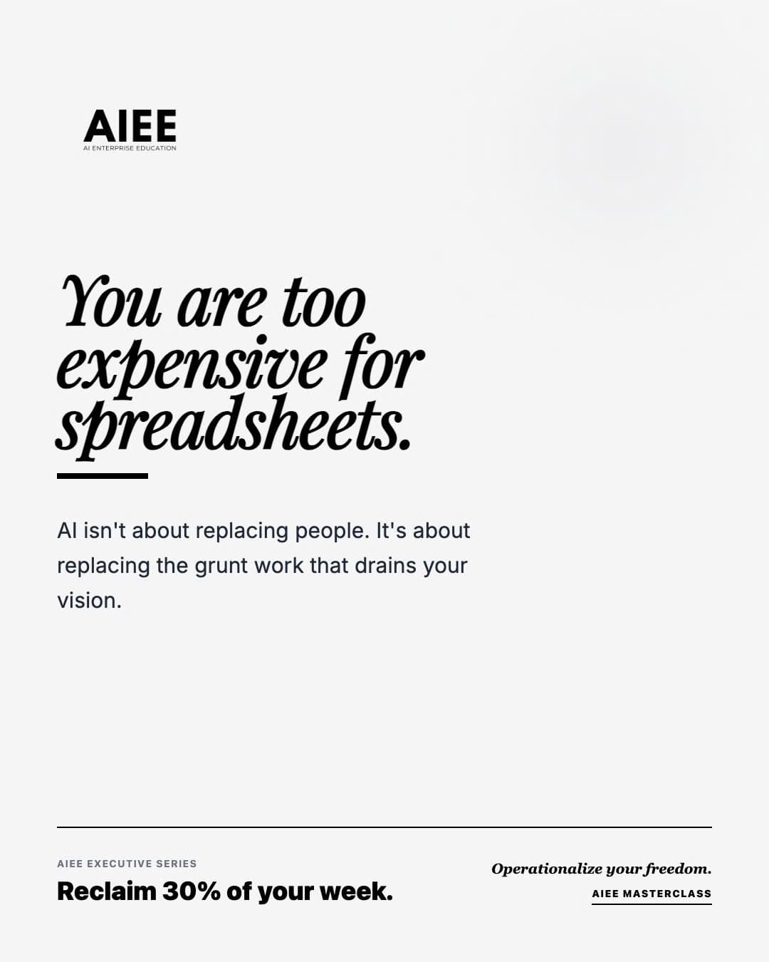
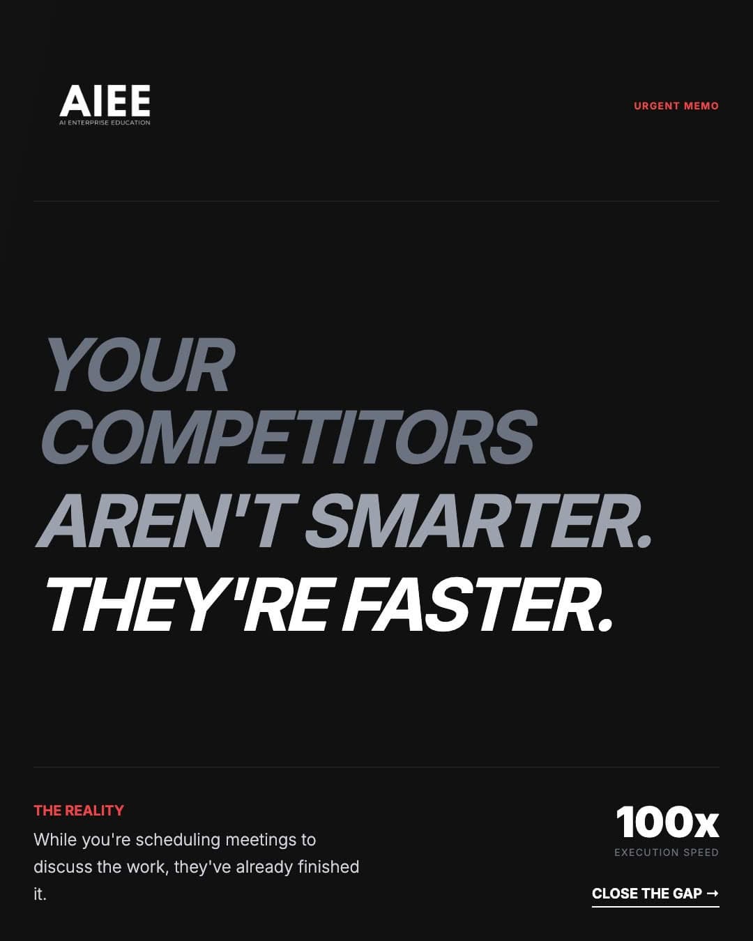
Reference: past AIEE marketing materials
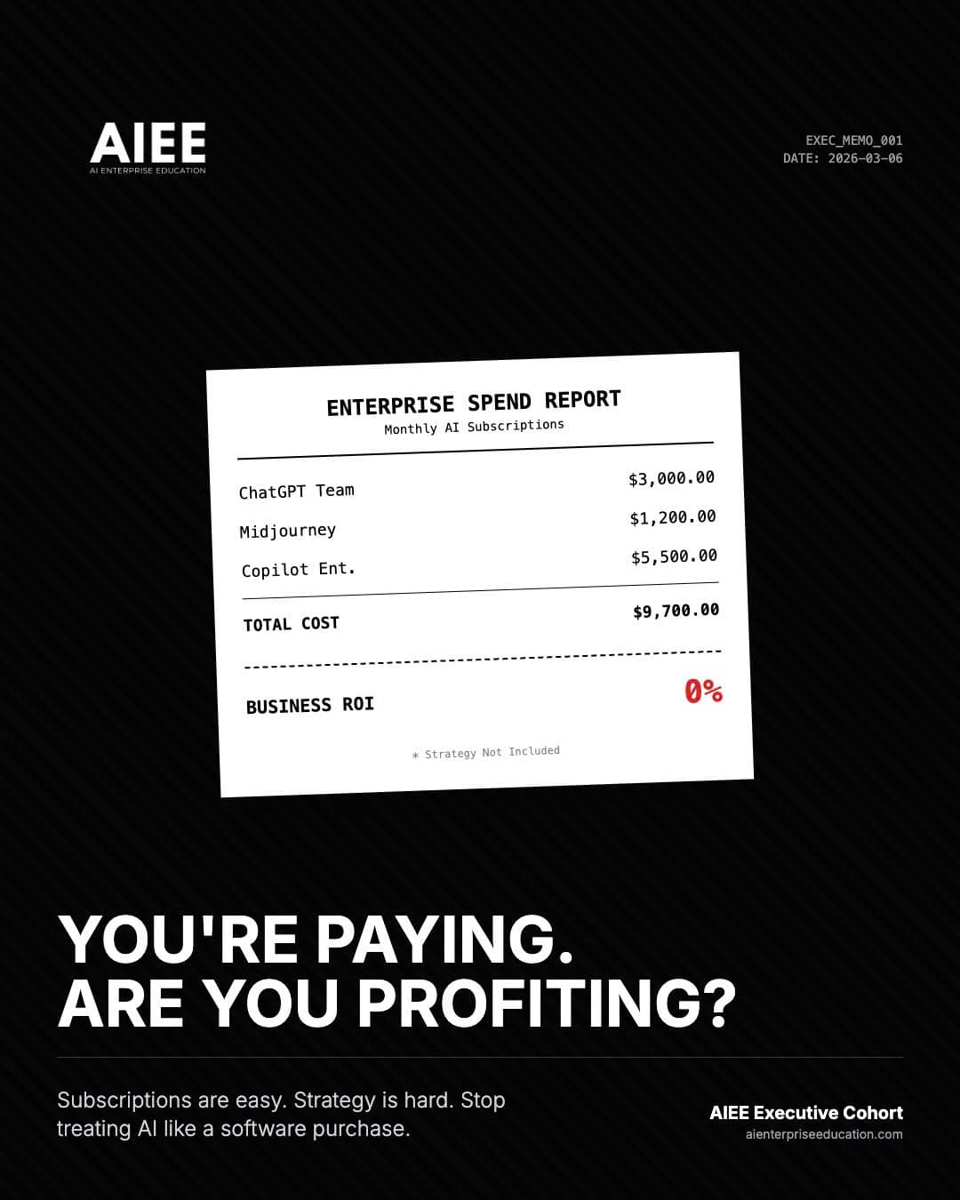
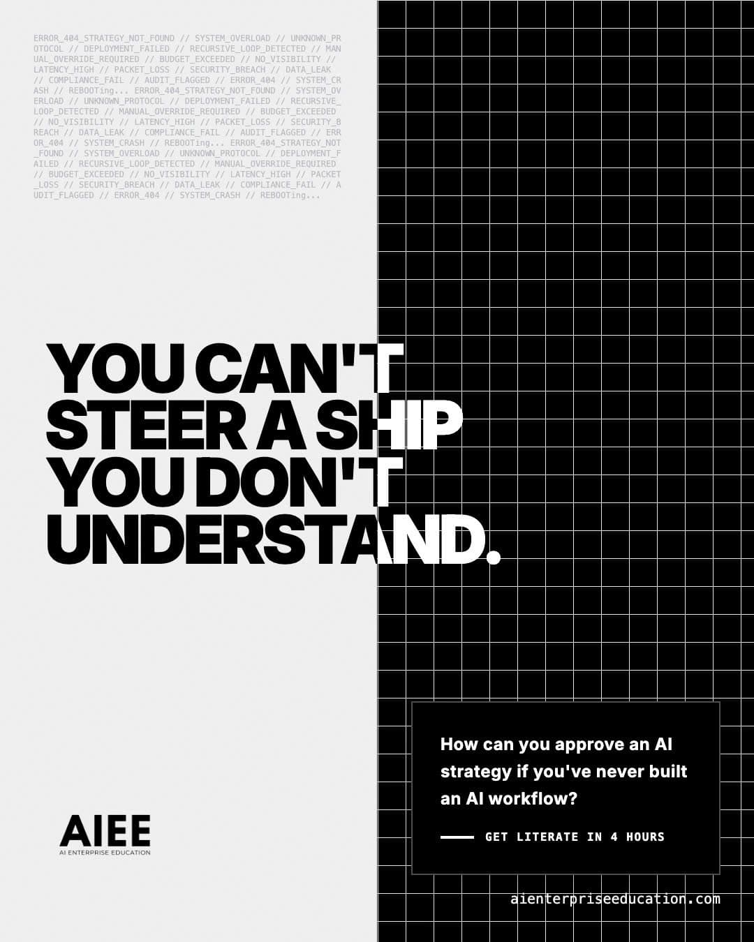
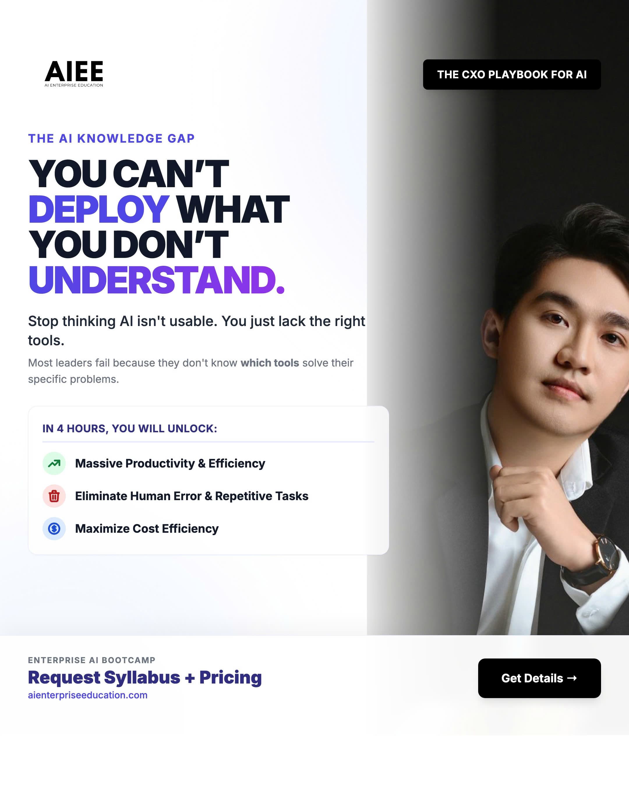
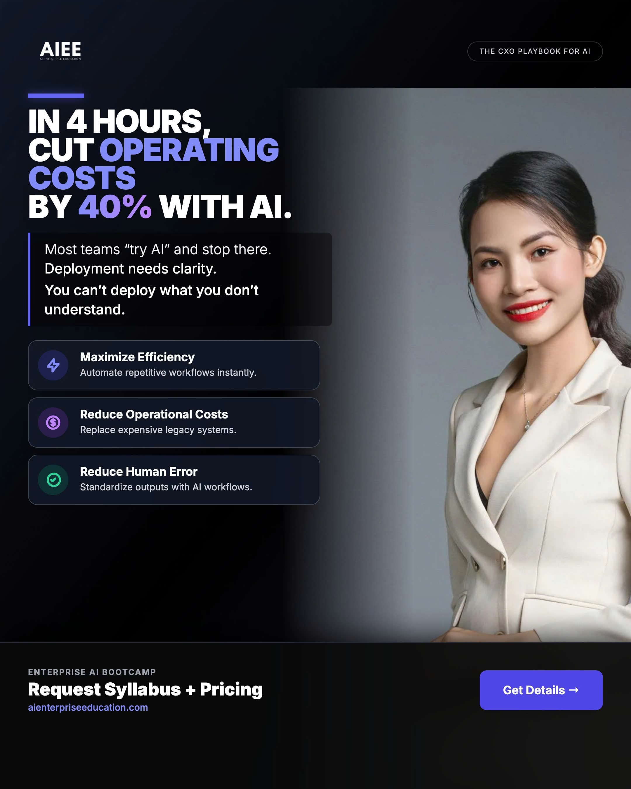
Below are real posters, flyers, and booth-style pieces your team has used. They illustrate tone, layout density, and photography style—use them alongside the templates above when briefing vendors.



Social media formats
Use the wordmark or approved logo centered on white or light neutral for profile images where possible. Keep critical content inside safe zones—platform UI overlays avatars and corners.
Official platform marks for identification (trademarks belong to their owners).
Live-style layout examples
Each card pairs the specification table with a realistic composition: where the avatar, cover, and headline read together. Export production assets from the master templates your team maintains in design tools—dimensions in the table are typical as of publication.
Illustrative layouts inspired by common social UI patterns. Trademarks belong to their owners; AIEE mockups are for brand guidance only.
Instagram
Profile, grid, and vertical video
Avatar is legible at 320×320; grid tiles should not carry fine print. For Stories/Reels, treat the bottom ~250px and top ~150px as reserved for platform UI—place titles and stickers above that band.
@aienterpriseeducation
Facebook
Page cover and overlapping avatar
The 820×312 cover is often cropped on mobile; center key message and logo. The circular profile (170×170) overlaps the cover—design both in one canvas so the transition stays intentional, not accidental.
AI Enterprise Education
AI Enterprise Education
12k · 2 · ···
LinkedIn
Professional banner and headline block
Banner 1584×396: keep wordmark and tagline inside the central safe area. Profile at 400×400 should remain simple (mark on white) while the cover carries the narrative for recruiters and partners.
AI Enterprise Education
X (Twitter)
Dark UI and high-contrast header
Header 1500×500: avoid mid-gray type on charcoal; test in dark mode. Profile 400×400 on near-black timelines should use white-backed logo artwork for crisp edges.
AI Enterprise Education
@aienterpriseedu
TikTok
Full-screen vertical (9:16)
Assume on-screen captions, share sheet, and profile chrome consume the bottom fifth. Keep faces, logos, and critical copy out of that band; end cards may include a single AIEE wordmark on white.
@aienterpriseeducation
YouTube
Channel banner and video shelf
Banner 2560×1440 with a desktop safe area of 1546×423—place logo and value proposition there, then verify TV and tablet crops. Profile 800×800 reads next to video titles; keep it bold and minimal.
AIEE
AI Enterprise Education
@AIEnterpriseEducation · 4.2k